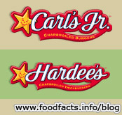
 Carl's Jr. and Hardee's unveiled their new logos this week. The new logos "feature a script type designed to give the brand names more of a personal feel, like a signature."
In a statement, Brad Haley, executive vice president of marketing for Carl's Jr. and Hardee's said: "Consumer research confirmed that the new logos were very well received among our base of young, hungry guys. We found that fast-food customers, as well as our brand loyalists, not only really liked the new look, but they also thought it better represented the quality of our menu offerings and that it gave the impression that the overall dining experience would be better."
Maybe it's just me, but don't they kinda look like the sewn on name patches you see on mechanics' shirts?
No comments:
Post a Comment