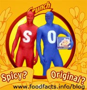
Church's Chicken has a new website design (www.churchs.com) that is stated to be the result of "a recent shift in ownership" that has "helped precipitate a renewed focus on marketing." The site features animation and sound effects and your visit is guided by 2 characters: "S" and "O", representing Spicy chicken and Original chicken. With their plastic bodysuits, they look like two guys from the blue man group, except one of them is red.
Farnaz Wallace, Church’s Chicken chief marketing officer, says "the site perfectly reflects Church’s brand personality which is fun, cool, irreverent, authentic and unique.”
The site is also aimed at potential franchisees. “The Web site allows potential franchisees to learn about the brand quickly while having fun,” said Wallace.
1 comment:
The new website for Church's Chicken is cute and absolutely useless. I could not scroll down the contact page and the irritating red and blue characters just played all over the page.
Tell me again who is supposed to be impressed by this waste of company money??
Post a Comment