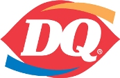
 Dairy Queen has updated their logo. But not by much. And some might say it's not much of an improvement... or that you really can't see much difference at all.
from DQ:
During 2007, a new master brand logo will be introduced to more than 5,600 locations worldwide. The traditional logo is the foundation for the new one, a more symmetrical ellipse enhanced with gold and blue curved swishes signifying food and treats. The DQ lettering also has been updated to a font that is more current, adding greater personality. This is the first time in company history that a new logo will be brand-centric for all of the concepts."Most revered in the quick service restaurant industry?" Okay, whatever you say!
"Our original DQ logo is one of the most revered in the quick service restaurant industry," said Michael Keller, chief brand officer for International Dairy Queen, Inc. "The new, modernized version encompasses the tried and true DQ ellipse with modifications made to show our growth as a brand and to reflect the fun and enjoyment associated with our food and soft-serve treats."
4 comments:
Something about DQ unleashing a new logo that looks literally exactly the same as the old one, and then heralding the "greater personality" is hilarious to me.
Something about this logo reminds me of construction paper and those crappy little snub-nose scissors we used in grade school. I hate this logo. I wish it would die.
This logo has been around for a long time under the "DQ Grill and Chill" restaurants, a more upscale and modern Dairy Queen division...
hate the logo crazy dq
Post a Comment